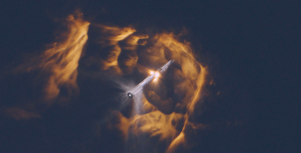
The biggest news in the markets today is SpaceX’s much‑anticipated IPO filing.
The company is aiming to raise roughly $75 billion at about a $1.75 trillion valuation, which would make it the largest IPO in history.
In its S‑1, filed May 20, 2026, SpaceX reports 2025 revenue in the high‑teens billions and a net loss of around $4.9 billion dollars, with a cumulative deficit in the tens of billions.
Interestingly, it seems that Rocket Man Elon’s biggest revenue generator wasn’t rockets at all … rather, the filing shows that connectivity (i.e. Starlink satellite internet) generated about $11.4 billion of revenue in 2025 and several billion dollars of operating income, while the launch and AI segments together still lost money.
In other words, the only clearly profitable pillar of Elon Musk’s space empire right now is a satellite internet business.
Starlink is printing cash for Musk, and that cash is helping fund rockets, deep‑space projects, and an aggressive AI build‑out.
Don’t think that Jeff Bezos missed the memo. Amazon is pouring billions into its 3,200‑plus‑satellite Project Kuiper constellation, turning low‑Earth‑orbit broadband into a full‑blown corporate space race.
So while most eyes this morning are glued to that $1.75 trillion figure with visions of massive rockets flying through the air …
… The real story might just be the impact that small low earth orbit (LEO) satellites are poised to make on a “space economy” that McKinsey estimates at $1.8 trillion.
And the good news is you don’t have to wait until SpaceX finally goes public to gain exposure to this market.
Just down the road from SpaceX and NASA at Cape Canaveral, there is a much smaller company positioning itself for the same satellite economy that Starlink just validated to the tune of multiple billions of dollars.
Starfighters Space (NASDAQ: FJET) is headquartered at Kennedy Space Center in Florida, operating out of a reusable launch vehicle hangar on Hangar Road in Cape Canaveral.
The company runs what it describes as the world’s only commercial fleet of flight‑ready F‑104 Starfighter supersonic aircraft, capable of sustained Mach 2 flight.
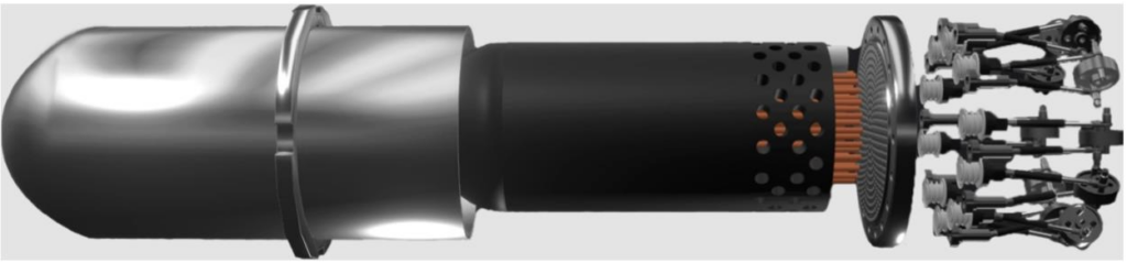
Starfighters Space (NASDAQ: FJET) currently operates seven modified F‑104s that can be configured as first‑stage lifting platforms.
These jets are designed to carry small rockets and payloads to about 45,000 feet for air‑launch to space.
The goal is to enable sub‑orbital launches to around 100 kilometers with a system called STARLAUNCH 1, and then to reach low Earth orbit (160 kilometers and above) with a next‑generation system called STARLAUNCH 2, which is expected to offer roughly 49 percent more thrust.
In late 2025 and early 2026, the company announced milestones for its STARLAUNCH I program, including completion of preliminary designs, manufacture of test articles with GE Aerospace’s Innoveering unit, and plans for wind‑tunnel work and drop tests.
Starfighters Space (NASDAQ: FJET) is also already generating revenue from adjacent activities. It offers pilot and astronaut training, in‑flight testing, and other aeronautics services to defense, civil, academic, and commercial customers.
Its F‑104 fleet supports hypersonic and high‑altitude test programs, and the company says that it is “market‑ready with minimal R&D effort” for its core flight operations while STARLAUNCH matures.
And this little-known company sits directly in the path of the trend SpaceX filing is igniting.
As more low‑Earth‑orbit constellations are funded—whether it is Starlink, Amazon’s 3,200‑plus‑satellite Amazon Leo project, or other regional and specialized networks — every one of those satellites needs a ride to orbit.
Large rockets will handle a lot of bulk deployment, but there is also demand for more targeted launches: smaller payloads, specific orbits, and more flexible timing.
This is the niche Starfighters Space (NASDAQ: FJET) is aiming at.
And, with the SpaceX IPO filed, the fuse is officially lit for this niche to explode.
IMPORTANT NOTICE AND DISCLAIMER: All investments are subject to risk, which must be considered on an individual basis before making any investment decision. This paid advertisement includes a stock profile of Starfighters Space, Inc. (NYSE: FJET). This paid advertisement is intended solely for information and educational purposes and is not to be construed under any circumstances as an offer to sell or a solicitation of an offer to purchase any securities. In an effort to enhance public awareness, Starfighters Space, Inc. (NYSE: FJET) is the sole source of funds for a budget of approximately $725,000 provided to CDMG INC the advertising agency to cover the costs associated with creating, printing and distribution of this advertisement. The advertising agency will retain any excess sums after all expenses are paid. Readers should beware that the advertising agency and/or its owners ,officers, principals, or affiliates own shares and/or stock options of Starfighters Space, Inc. (NYSE: FJET) and therefore have an additional incentive to see the company’s stock perform well. This share ownership should be viewed as a major conflict with our ability to be unbiased. This is why we stress that you conduct extensive due diligence as well as seek the advice of your financial advisor or a registered broker-dealer before investing in any securities. While this advertisement is being disseminated and for a period of not less than 90 days thereafter, the advertising agency and their respective officers, principals, or affiliates will not sell securities of Starfighters Space, Inc. (NYSE: FJET). If successful, this advertisement will increase investor and market awareness of Starfighters Space, Inc. (NYSE: FJET) and its securities, which may result in an increased number of shareholders owning and trading the securities, increased trading volume, and possibly an increase in share price, which may be temporary. This advertisement and the advertising agency do not purport to provide a complete analysis of Starfighters Space, Inc. (NYSE: FJET) or its financial position. They are not, and do not purport to be, broker-dealers or registered investment advisors. This advertisement is not, and should not be construed to be, personalized investment advice directed to or appropriate for any particular investor. Any investment should be made only after consulting a registered broker-dealer or registered investment advisor or, at a minimum, doing your own research if you do not utilize an investment professional to make decisions on what securities to buy and sell, and only after reviewing the financial statements and other pertinent publicly-available information about Starfighters Space, Inc. (NYSE: FJET). Further, readers are specifically urged to read and carefully consider the Risk Factors identified and discussed in Starfighters Space, Inc. (NYSE: FJET) SEC filings. Investing in microcap securities such as Starfighters Space, Inc. (NYSE: FJET) is speculative and carries a high degree of risk. Past performance does not guarantee future results. This advertisement is based exclusively on information generally available to the public and does not contain any material, non-public information. The information on which it is based is believed to be reliable. Nevertheless, the advertising agency cannot guarantee the accuracy or completeness of the information and is not responsible for any errors or omissions. This advertisement contains forward-looking statements, including statements regarding expected continual growth of Starfighters Space, Inc. (NYSE: FJET) and/or its industry. The advertising agency notes that statements contained herein that look forward in time, which include everything other than historical information, involve risks and uncertainties that may affect Starfighters Space, Inc. (NYSE: FJET) actual results of operations. Factors that could cause actual results to vary include the size and growth of the market Starfighters Space, Inc. (NYSE: FJET) products and/or services, the company’s ability to fund its capital requirements in the near term and long term, federal and state regulatory issues, pricing pressures, etc. All trademarks used in this advertisement are the property of their respective trademark holders and no endorsement by such owners of the contents of this advertisement is made or implied. The advertising agency is not affiliated, connected, or associated with, and is not sponsored, approved, or originated by, the trademark holders unless otherwise stated. No claim is made to any rights in any third-party trademarks.